
Using 3D Visualization in Architecture Competitions: How to Stand Out
Architecture competitions are brutal. Hundreds of entries, elite juries, minutes of review time per board. Your concept might be brilliant, but if the jury can't understand it in 30 seconds, you're out. This is where 3D visualization becomes your competitive weapon — not just pretty pictures, but strategic visual communication that clarifies bold ideas, demonstrates feasibility, and creates emotional resonance. The right renders don't just show your design; they make juries believe in it.
In this comprehensive guide, we explore how to use 3D visualization strategically in architecture competitions. You'll learn what juries look for, which rendering styles work best, how to structure presentation boards for maximum impact, technical execution tips, and real strategies that have helped winning entries stand out. Whether you're entering international ideas competitions or regional RFPs, this guide will sharpen your visual storytelling.
Primary keyword: 3D visualization in architecture competitions. Related LSI keywords: architecture competition rendering, design competition visualization, competition presentation boards, jury presentation, conceptual rendering, architectural competition strategy, winning architecture competitions, competition graphics.
The architecture competition landscape
Why competitions matter
- Portfolio building: High-profile wins elevate studio reputation
- Design freedom: Explore bold concepts without client constraints
- Network access: Connect with juries, sponsors, and media
- Business development: Competitions often lead to commissions
What juries evaluate
- Concept clarity: Is the big idea immediately understandable?
- Design resolution: Does it feel thought-through or vague?
- Context response: Does it address site, program, and constraints?
- Innovation: What's new or challenging here?
- Feasibility: Could this actually be built?
- Narrative: Does the project tell a compelling story?
3D visualization directly impacts all six criteria.
Why 3D visualization wins competitions
1. Immediate spatial understanding
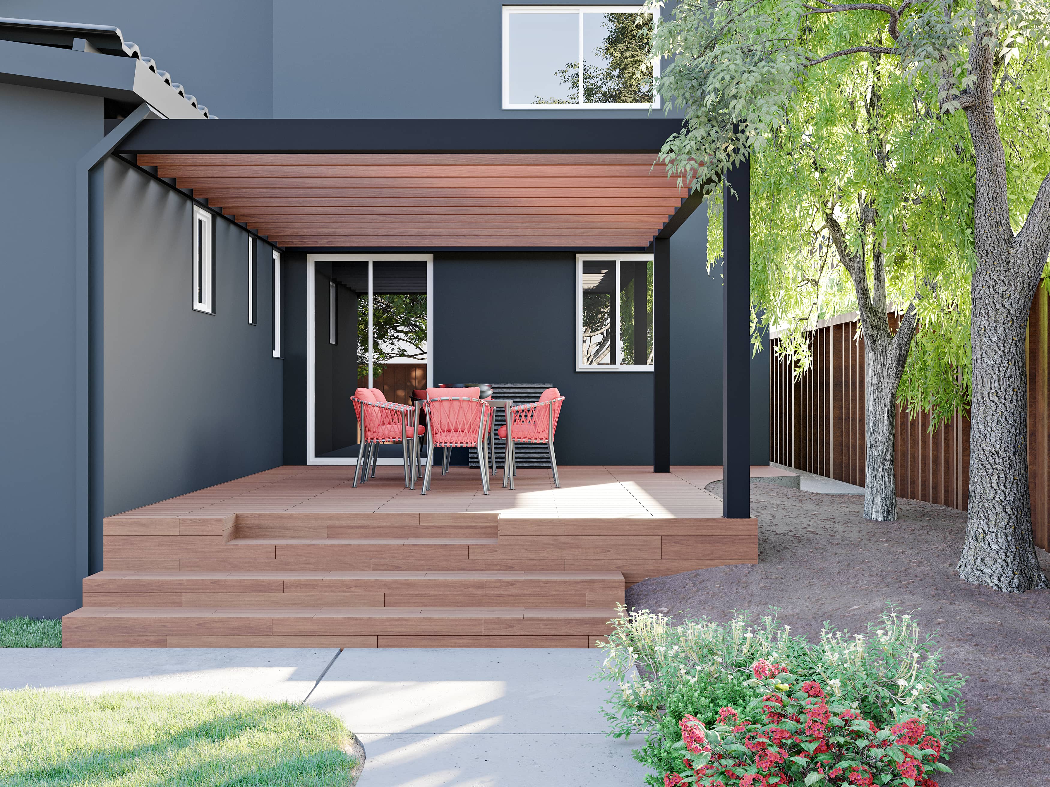
Plan and section drawings require architectural literacy. A well-composed perspective render communicates space, scale, and atmosphere instantly — even to non-architects on juries.
2. Emotional engagement
Renderings evoke feelings. A sunrise view through a soaring atrium, people gathering in a civic plaza — these moments create connections that diagrams can't.
3. Demonstrates design confidence
High-quality visualization signals: "This is resolved. This is real." It separates serious entries from hasty sketches.
4. Communicates materiality and light
How does light filter through your façade? How does stone meet glass? 3D renders show these critical details that elevate design thinking.
5. Shows experience and lifecycle
Renderings can depict summer festivals, winter markets, morning commutes, evening gatherings — showing the building as a lived environment over time.
Rendering styles for competitions
Not all competitions need photorealism. Match style to concept stage and competition goals.
Photorealistic rendering
When to use:
- Final-stage competitions requiring feasibility demonstration
- Civic and institutional projects needing stakeholder trust
- Proposals where material and light quality are central to the concept
Strengths:
- Maximum believability
- Shows precise material and lighting design
- Appeals to conservative juries and clients
Watch-outs:
- Time-intensive; may limit design iteration
- Can feel generic if not art-directed
Stylized/conceptual rendering
When to use:
- Early-stage ideas competitions
- Projects prioritizing narrative over detail
- Entries targeting design innovation over buildability
Styles:
- Line work with selective color
- Clay/white model with atmospheric lighting
- Watercolor/painterly for warmth and craft
- Collage with mixed media for editorial impact
Strengths:
- Faster iteration; supports design exploration
- Memorable and distinct visual identity
- Focuses on form and concept over finish
Watch-outs:
- Can feel unresolved if used inappropriately
- May not satisfy juries wanting technical confidence
Hybrid approach (most common)
Combine photorealism for hero views and key spaces with stylized diagrams, axonometrics, and sketches for concept communication. This balances impact and clarity.
Strategic rendering: what to visualize
Not every view matters equally. Be strategic.
Hero exterior view
Purpose: Establish iconic presence and context.
Guidelines:
- Eye-level or slightly elevated (human-relatable)
- Show key façade and massing moves
- Include context: site, neighbors, landscape
- Time of day: Golden hour or dusk for emotion
- People and activity: Suggest program and scale
Key interior/spatial moment
Purpose: Show experiential quality and atmosphere.
Guidelines:
- Capture the "wow" space (atrium, plaza, main hall)
- Demonstrate light quality and materiality
- Include people interacting with space
- Reveal spatial drama (height, transparency, connections)
Section perspective or exploded axon
Purpose: Clarify spatial organization and relationships.
Guidelines:
- Use selective transparency and cutaways
- Show multiple floors and vertical connections
- Color-code programs or zones
- Annotate key features without clutter
Contextual aerial/bird's-eye
Purpose: Show site integration and urban response.
Guidelines:
- Include immediate neighborhood and landmarks
- Show roofscape and massing strategy
- Indicate green space, circulation, public access
- Use atmospheric perspective for depth
Detail vignettes
Purpose: Demonstrate material thinking and craft.
Guidelines:
- Close-ups of façade systems, joints, textures
- Human scale: hand on railing, person at threshold
- Show material transitions and assembly logic
Presentation board composition
Jury members spend 30–90 seconds per board. Layout is critical.
Board hierarchy and flow
Top third: Impact zone
- Hero image or title/concept diagram
- This is the first scan; it must hook
Middle: Development and support
- Plans, sections, diagrams, additional renders
- Clear labels and annotations
- Logical left-to-right or top-to-bottom flow
Bottom: Detail and context
- Material palettes, technical notes, site analysis
- Supporting images and references
Visual balance
- Avoid symmetry (feels static); use dynamic asymmetry
- Create visual weight with large images balanced by grouped small ones
- White space guides the eye; don't crowd
Typography and graphics
- Hierarchy: Large titles, mid-size captions, small body text
- Limit fonts: 2 families maximum
- Use diagrams and icons for quick reads
- Color-code consistently across boards
Common layout mistakes
- Text blocks too small or dense
- No clear entry point or visual path
- Competing hero images (dilutes focus)
- Inconsistent graphic language across boards
Technical execution tips
Camera and composition
- Use realistic focal lengths (24–50mm equivalent)
- Human eye height for relatability (1.6–1.7m)
- Rule of thirds; avoid centered compositions
- Leading lines and foreground interest
Lighting for drama
- Avoid flat lighting; use directional key light
- Show contrast and shadow for depth
- Golden hour or dusk for emotion
- Interior light glow for occupied feeling
Material and detail level
- Focus detail where it matters (hero spaces, close-ups)
- Simplify distant or secondary elements
- Use realistic materials with subtle imperfections
- Show construction logic (joinery, layers, systems)
Entourage and scale
- People: Diverse, active, contextually appropriate
- Avoid stock cutouts that scream "render"
- Vehicles, bikes, street furniture for context
- Seasonal cues (snow, leaves, flowering plants)
Post-production
- Color grading for mood consistency across images
- Subtle vignette to focus attention
- Avoid over-processing (HDR look, heavy filters)
- Maintain natural color balance
Narrative and storytelling
Winning entries tell stories. Use 3D visualization to build a narrative arc.
Story structure
- Context/problem: Show existing site condition or challenge
- Concept/intervention: Introduce your big idea (diagram + render)
- Experience: Walk through key moments and spaces
- Impact: Show benefits (community use, sustainability, cultural value)
Sequencing renders
- Start wide (context), zoom in (details), pull back (impact)
- Show transformation: before/after, day/night, seasonal change
- Use time-lapse or sequence to show activity and change
Emotional beats
- Arrival: First impression, threshold moment
- Discovery: Revealing spatial surprise or key feature
- Occupation: People using, enjoying, gathering
- Legacy: Long-term integration into urban fabric
Case study: Winning cultural center competition
Brief: Civic arts center for a mid-size European city. Open international competition; 300+ entries.
Concept: "Urban Living Room" — A permeable ground floor that extends the plaza into the building, topped by a dramatic cantilevered gallery volume.
3D visualization strategy:
- Hero render: Dusk view from plaza showing glowing ground floor, people moving through, cantilevered volume floating above. Warm interiors contrast with blue hour sky.
- Section perspective: Cutaway showing vertical programmatic stacking, transparency of ground floor, and connection to roof terrace.
- Interior moment: Inside the main gallery, dramatic natural light from clerestory, visitors engaging with art.
- Contextual aerial: Bird's-eye showing building as urban connector; new plaza linkages highlighted.
- Detail vignettes: Façade system close-up showing modular panels and material transitions.
Rendering style: Photorealistic for hero and interior; stylized linework with selective color for section and diagrams.
Result: First place. Jury cited clarity of concept, demonstrated feasibility, and compelling spatial narrative.
Key takeaway: Strategic mix of rendering styles; each image answered a specific jury question (What is it? How does it work? What's it like inside? How does it fit?).
Time and resource management
Competitions have tight deadlines. Manage visualization workload strategically.
Prioritize ruthlessly
- Identify 2–3 must-have hero renders
- Use diagrams and hybrid graphics for secondary views
- Don't render every space; show the critical moments
Iterate concepts, not pixels
- Use quick clay renders or sketches to test compositions
- Lock cameras and lighting early
- Refine materials and details only after design is stable
Reuse assets
- Build a library of entourage (people, cars, trees)
- Save lighting setups and camera presets
- Use same base materials across views for consistency
Outsource strategically
- Keep concept and layout in-house
- Outsource final rendering to specialists if time is tight (e.g., Space Visual)
- Use render farms for overnight turnarounds
Common mistakes that cost wins
1. Over-rendering at the expense of concept
Problem: Beautiful but vague images that don't clarify the idea.
Fix: Render strategically to support concept; don't let visuals become decoration.
2. Inconsistent visual language
Problem: Mix of styles and moods that feel scattered.
Fix: Define a graphic system; maintain consistency across all boards.
3. Ignoring site context
Problem: Building floats in white space or generic environment.
Fix: Show real site conditions, neighbors, topography.
4. Poor board layout
Problem: Cluttered, hard-to-read boards with no hierarchy.
Fix: Design boards like posters; clear entry, visual flow, breathing room.
5. Generic, stock imagery
Problem: Cutout people and props that scream "template."
Fix: Use custom entourage; integrate naturally; match project demographic.
Tools and workflow
3D software
- Modeling: Rhino, SketchUp, Revit, ArchiCAD
- Rendering: V-Ray, Corona, Enscape, Lumion, Twinmotion, Cycles
- Real-time: Unreal Engine, Unity (for interactive or VR submissions)
Post-production
- Photoshop: Compositing, color grading, final touch-ups
- Illustrator: Diagrams, vector graphics, layout elements
- InDesign: Board layout and typography
Presentation assembly
- InDesign or Illustrator for multi-board layouts
- Figma or Miro for collaborative layout iteration
- Export high-res PDFs or print-ready files per competition requirements
Competition-specific considerations
Open ideas competitions
- Emphasize concept clarity and boldness
- Stylized or hybrid rendering works well
- Narrative and diagrams are critical
Developer/RFP competitions
- Photorealism to demonstrate feasibility
- Show construction logic and phasing
- Include cost and schedule indicators
Student competitions
- Experiment with visual styles
- Push conceptual boundaries
- Strong diagrams + 1–2 killer renders
International competitions
- Consider cultural context in entourage and materiality
- Clear, universal visual language (less text-dependent)
- High-resolution for large-format judging
FAQ
How many renders should I include in a competition entry?
Typically 2–4 hero renders plus supporting diagrams and sections. Quality over quantity — each render should answer a specific question or show a critical moment. Too many dilutes impact.
Should I use photorealistic or stylized rendering for competitions?
Depends on the competition stage and goals. Photorealism works for feasibility and trust; stylized works for concept clarity and memorability. Hybrid approaches (photoreal heroes + stylized diagrams) are most common and effective.
How do I make my competition boards stand out?
Strong visual hierarchy, clear concept narrative, strategic use of white space, consistent graphic language, and high-quality hero images. Avoid clutter. Design boards to be understood in 30 seconds.
Is it worth outsourcing rendering for competitions?
Yes, if it frees you to focus on design and strategy. Professional rendering studios (like Space Visual) can deliver high-quality, competition-ready images on tight deadlines, often faster and better than in-house under time pressure.
What's the biggest mistake architects make in competition presentations?
Overcomplicating boards with too much information or too many competing images. The best entries have a clear, bold concept communicated through a few strong visuals and minimal, strategic text. Clarity wins.
Conclusion: visualization is strategy, not decoration
3D visualization in architecture competitions isn't about making things look pretty — it's about strategic communication. The right renders clarify bold ideas, demonstrate feasibility, create emotional connection, and make juries believe your concept is the winner. In a field of hundreds, the teams that win are those that understand visualization as a tool for persuasion, not just representation.
Space Visual partners with architects on competition entries — from concept visualization and hero renders to complete board layout and graphic identity. We understand the pressure, the deadlines, and what juries respond to. If you're preparing a competition entry and want visualization that helps you stand out, we'll provide a fast quote and sample frames.
Call to action: Ready to win your next competition? Contact Space Visual for strategic 3D visualization and presentation design that impresses juries.
Explore Latest Blogs
3D Product Visualization: Boosting E‑commerce Sales with Interactive Renders
A comprehensive guide to 3D product visualization for e‑commerce — how interactive renders, 360° viewers, and animations increase conversions, reduce photoshoot costs, and speed up launches.

How 3D Renderings Help in Client Approvals and Faster Project Sign-off
A comprehensive guide to using 3D renderings for faster client approvals and project sign-off — covering decision psychology, approval workflows, cost savings, and stakeholder communication strategies.
