
Photorealistic Rendering vs Stylized Rendering: Which Works Better for Your Project?
Choosing between photorealistic rendering and stylized rendering can make or break your project’s impact. If you’re a developer preparing a launch, an architect pitching a concept, or a marketer creating campaign visuals, the rendering style you choose directly affects clarity, emotion, and conversion.
In this expert guide, we compare photorealistic rendering and stylized rendering with practical examples, pros and cons, and a simple decision framework you can use today. By the end, you’ll know exactly which style to pick for presentations, competitions, stakeholder buy-in, and pre-sales marketing.
Target readers: architects, interior designers, developers, product owners, and marketing teams who commission 3D visualization.
Primary keyword: photorealistic rendering vs stylized rendering. Related LSI keywords: architectural visualization styles, 3D rendering for marketing, conceptual renders, realistic 3D visualization, cinematic renders, artistic visualization.
Quick definitions (so we speak the same language)
What is photorealistic rendering?
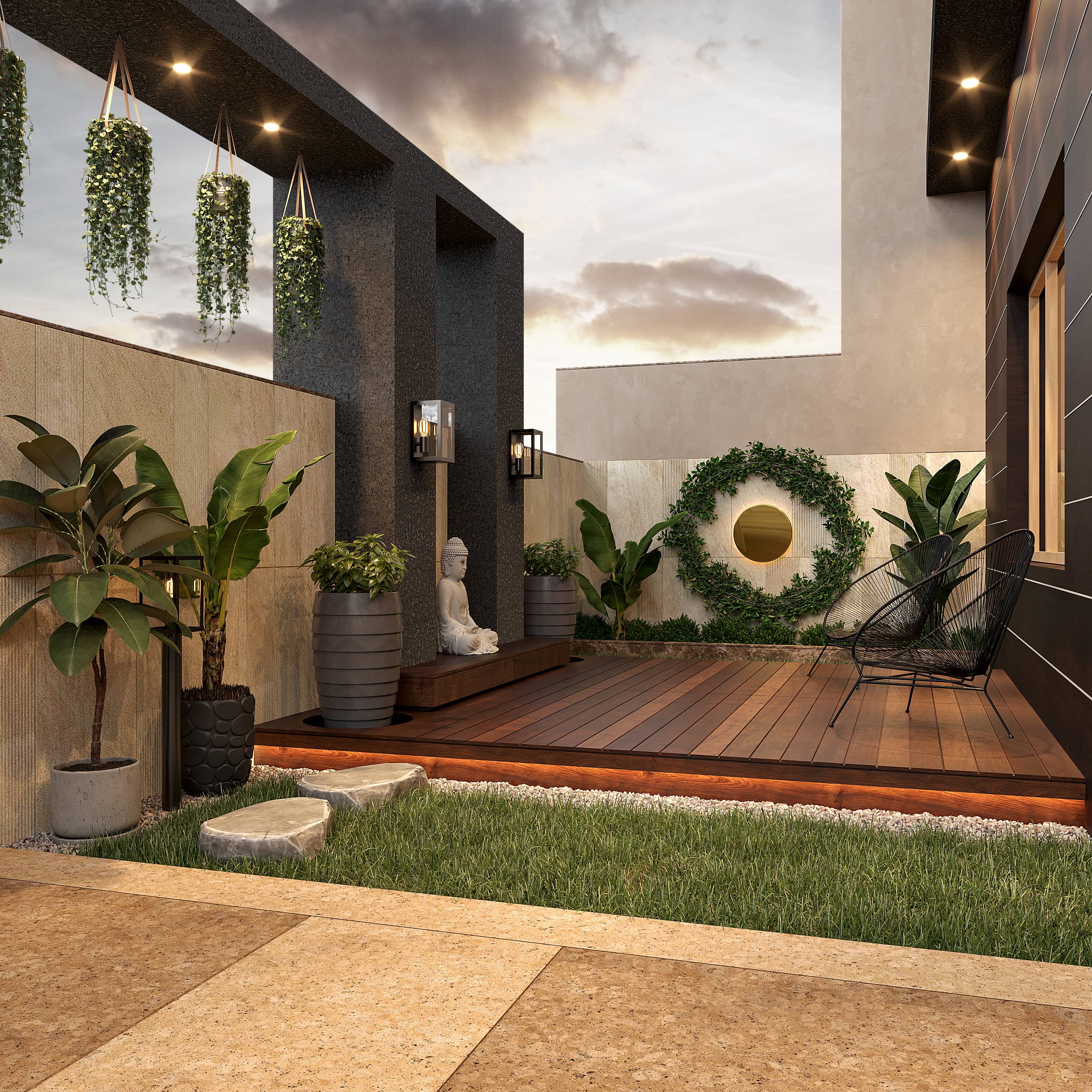
Photorealistic rendering aims to mimic real-world materials, lighting, and camera behavior so closely that the final image could be mistaken for a photograph. It prioritizes accuracy, material fidelity, and physically based lighting.
Typical uses:
- Marketing imagery for real estate listings and brochures
- Investor presentations and planning approvals
- Product visualization with exact finishes and materials
What is stylized rendering?
Stylized rendering emphasizes mood, concept, narrative, or artistic intent over strict realism. It may use simplified materials, non-photoreal lighting, linework, clay look, watercolor/hand-drawn vibes, or cinematic grading to evoke a specific emotion.
Typical uses:
- Early design concepts and competitions
- Vision decks and brand mood explorations
- Editorial visuals and marketing campaigns seeking a unique aesthetic
Visual comparison: how the same scene reads in two styles
While we can’t embed your project’s visuals here, imagine the same living room scene rendered in two ways:
- Photorealistic: PBR materials, accurate daylight, soft contact shadows, realistic reflections in glass, calibrated camera exposure. The space looks ready to move in.
- Stylized: Clay materials with a warm directional light; edges outlined; selective color accents on furniture; high-contrast grading for drama. The space feels conceptual and expressive.
Client takeaway: photorealistic rendering sells the finished vision; stylized rendering sells the idea and mood.
Pros and cons at a glance
Photorealistic rendering — strengths
- Sets accurate expectations for materials, finishes, and lighting
- Ideal for marketing, pre-sales, and approvals
- Builds trust with stakeholders who prefer photo-like clarity
- Strong ROI when used across ads, listing portals, and print
Photorealistic rendering — watch-outs
- Requires precise inputs (final materials, details, and accurate models)
- More production time for fine materials, lighting, and post
- Overly clinical if not art-directed
Stylized rendering — strengths
- Faster for early design communication and iterations
- Encourages focus on massing, light direction, and spatial concept
- Memorable visuals for competitions or brand-forward campaigns
- Flexible aesthetic: clay, linework, watercolor, cinematic, toon
Stylized rendering — watch-outs
- Less suitable for buyers expecting finished realism
- Can cause misinterpretation if used too late in the process
- Requires clear notes indicating conceptual status
When to use photorealistic rendering
Choose photorealistic rendering when the goal is clarity, persuasion, or conversion.
Great fits:
- Real estate marketing (listings, brochures, OOH ads)
- Investor decks and municipal approvals
- Interior design portfolios showcasing finishes and decor
- Product visualization (kitchens, lighting fixtures, furniture)
Signs you’re ready for photorealism:
- You have final (or near-final) materials and furniture selections
- You can supply accurate CAD/Revit and site photos
- You’re preparing launch-ready assets with clear brand positioning
Pro tip: If materials aren’t locked, plan a short photoreal “lookdev” round — 2–3 variants per scene — before rendering the final hero images.
When to use stylized rendering
Choose stylized rendering when you need speed, story, or mood over detail.
Great fits:
- Early-stage concept studies and feasibility presentations
- Design competitions where originality and narrative matter
- Brand explorations and editorial content
- Stakeholder workshops where multiple options are reviewed quickly
Popular stylized looks:
- Clay/white model with directional light for form-reading
- Linework overlay (NPR) to emphasize edges and proportions
- Watercolor/hand-drawn for warmth and craft
- Cinematic grading with strong contrast and color cast
Pro tip: Add minimal color accents (plants, art, a single chair) to guide the eye in clay renders without sacrificing the conceptual feel.
Decision framework: which rendering style works better for your project?
Use this simple 5-question checklist:
- What’s the goal — sell/approve or explore/ideate?
- How defined are materials and details — final or fluid?
- Who is the audience — buyers/investors or designers/critics?
- What’s the timeline — weeks for polish or days for options?
- What emotions should the image evoke — confidence and trust, or curiosity and imagination?
If most answers lean toward sell/approve, final, buyers/investors, and confidence/trust — choose photorealistic rendering. If they lean toward explore/ideate, fluid, designers/critics, and curiosity/imagination — choose stylized rendering.
Hybrid approach: many successful projects use stylized renders early, then transition to photorealistic visuals for marketing. Reusing cameras and base models keeps costs efficient.
Production differences: pipeline and effort
While the early steps (brief, modeling, camera selection) overlap, the requirements diverge later.
Photorealistic pipeline highlights
- Precise PBR materials with correct scale and micro detail
- Calibrated lighting (HDRI + photometric lights) and balanced exposure
- Render passes (beauty, reflection, AO, Z-depth, IDs) for flexible post
- Detailed post-production with compositing, sky replacement, people/vehicles integration, and print-ready color management
Stylized pipeline highlights
- Simplified materials (clay, toon, linework) and deliberate light direction
- Strong composition and graphic readability over surface detail
- Minimal post: tonal grading, vignette, halftone/ink effects if desired
- Optional 2D overlays to reinforce the hand-crafted feel
Time/cost rule of thumb:
- Stylized stills can be 20–40% faster for early studies
- Photoreal stills demand more hours in materials, lighting, and post — but pay off in marketing performance
Performance in marketing: what the data suggests
From our experience and industry benchmarks, photorealistic rendering typically outperforms stylized visuals in click-through rate (CTR) and conversion for real estate listings and ads because buyers want to “see the finished thing.”
However, stylized rendering often wins in design competitions, concept votes, and social engagement when the audience expects originality and narrative.
Suggested test: run an A/B campaign for a social ad — one photoreal, one stylized. Track CTR, dwell time, and inquiries. Use the winner in paid campaigns and keep the other for organic brand content.
Visual examples you can imagine (and what they teach)
- Exterior hero — Photoreal: detailed facade, realistic reflections, shadow softness matching time of day. Stylized: clay facade with strong rim light; a single color accent on signage. Lesson: photoreal builds trust; stylized builds mood.
- Kitchen interior — Photoreal: PBR marble with subtle roughness, calibrated metal reflections, soft daylight bounce. Stylized: linework with flat color blocks emphasizing layout. Lesson: use photoreal for product/finish accuracy; stylized for layout evaluation.
- Masterplan aerial — Photoreal: varied vegetation proxies, atmospheric perspective, cars and people for scale. Stylized: white model with color-coded program zones. Lesson: stylized clarifies planning; photoreal sells place-making.
Common mistakes to avoid
- Using photorealism too early — you’ll revise expensive materials and lighting multiple times
- Using stylization too late — stakeholders may misread the level of final detail
- Over-grading images — heavy filters can hide design intent and reduce credibility
- Ignoring camera height and lens — even stylized images need believable perspective
Pro tip: Always annotate stylized renders with notes like “conceptual — materials indicative” to avoid confusion.
Budgeting and timelines
Indicative ranges for still images (vary by region and scope):
- Stylized concept still: $200–$700
- Photoreal interior/exterior still: $400–$2,000+
Timeline (per view):
- Stylized: 2–5 days
- Photoreal: 4–10 days
Large campaigns, animations, or virtual tours require custom scoping. Reusing base models, cameras, and assets between styles reduces cost significantly.
FAQ
What’s better for real estate marketing — photorealistic or stylized rendering?
Photorealistic rendering usually performs better for marketing and pre-sales because it communicates the final look and builds trust. Stylized rendering is better for early concept exploration and competitions.
Can we start stylized and later move to photorealistic?
Yes. Many clients begin with clay or linework to align on composition, then we reuse cameras and models for photoreal finals. This approach is efficient and keeps creative momentum.
Do photorealistic renders always take longer?
Not always, but they usually require more time for materials, lighting, and post-production. Using a render farm and solid lookdev speeds things up.
Can stylized renders be used in marketing?
They can be, especially for brand-forward campaigns, but if your audience expects exact finishes and realism, photorealistic rendering tends to convert better.
What files do we receive at the end?
Typically high-res PNG/JPEG/TIFF images. On request, we can deliver layered PSD/EXR with passes, and simplified 3D assets for future work.
Conclusion: pick with purpose — and switch styles as you advance
Photorealistic rendering vs stylized rendering is not a binary choice — it’s a timeline. Use stylized renders to explore, align, and pitch. Switch to photorealistic renders to persuade, sell, and launch. The smartest teams move fluidly between the two, reusing cameras and base models to control cost and keep quality consistent.
If you’re unsure which style fits your next milestone, Space Visual can audit your goals and propose a style roadmap with sample frames, timelines, and costs.
Call to action: Ready to choose the right rendering style? Contact Space Visual for a tailored proposal and sample frames for your project.
Explore Latest Blogs
3D Product Visualization: Boosting E‑commerce Sales with Interactive Renders
A comprehensive guide to 3D product visualization for e‑commerce — how interactive renders, 360° viewers, and animations increase conversions, reduce photoshoot costs, and speed up launches.

How 3D Renderings Help in Client Approvals and Faster Project Sign-off
A comprehensive guide to using 3D renderings for faster client approvals and project sign-off — covering decision psychology, approval workflows, cost savings, and stakeholder communication strategies.
